The app was really structured and clean, easy to navigate as well! The only issue is that there is too much going on, and can be overwhelming for individuals.
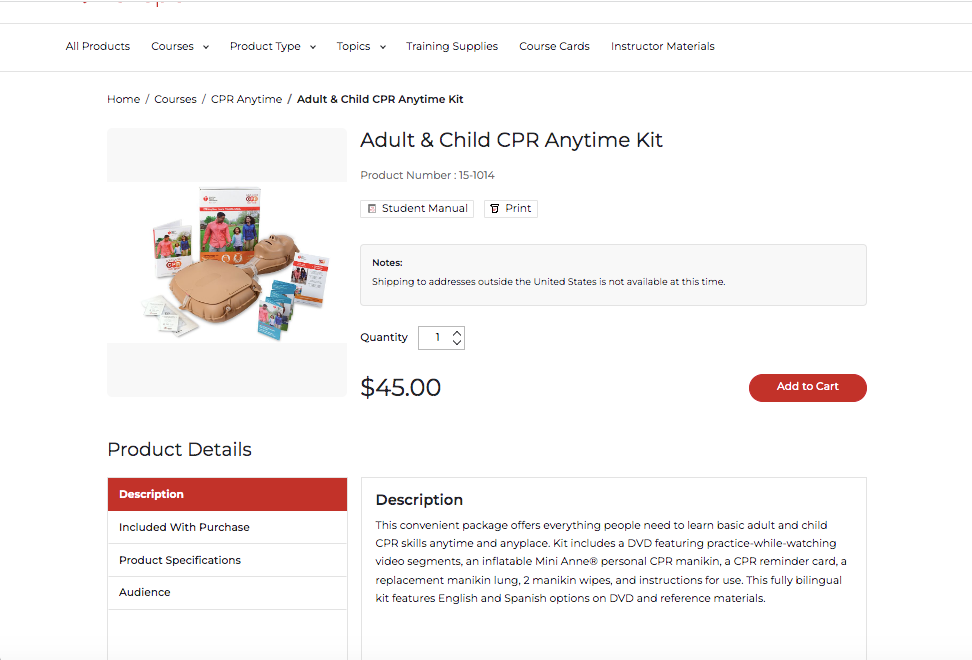
Pricing of the CPR kit is nearly $50!
Like the AHA app, the National Safety Council app had a TON of information relating to CPR. However, there was only pictures for individuals to go off of to learn CPR. There was also too much information in some instances, which can be overwhelming.

NSC pricing is a bit more affordable than AHA, however, it is only available for purchase for businesses or schools. Individuals who are members also get a discounted rate, which might not be the situation for all individuals.
The app was one of the best looking ones of the competitors, with guides for CPR for trained and untrained individuals. Some of this information is hidden among SO much more information, which might be annoying in the case of an emergency.

$37 is a pretty fair price for classes, but what about the individuals that cannot afford even this? What would they do?
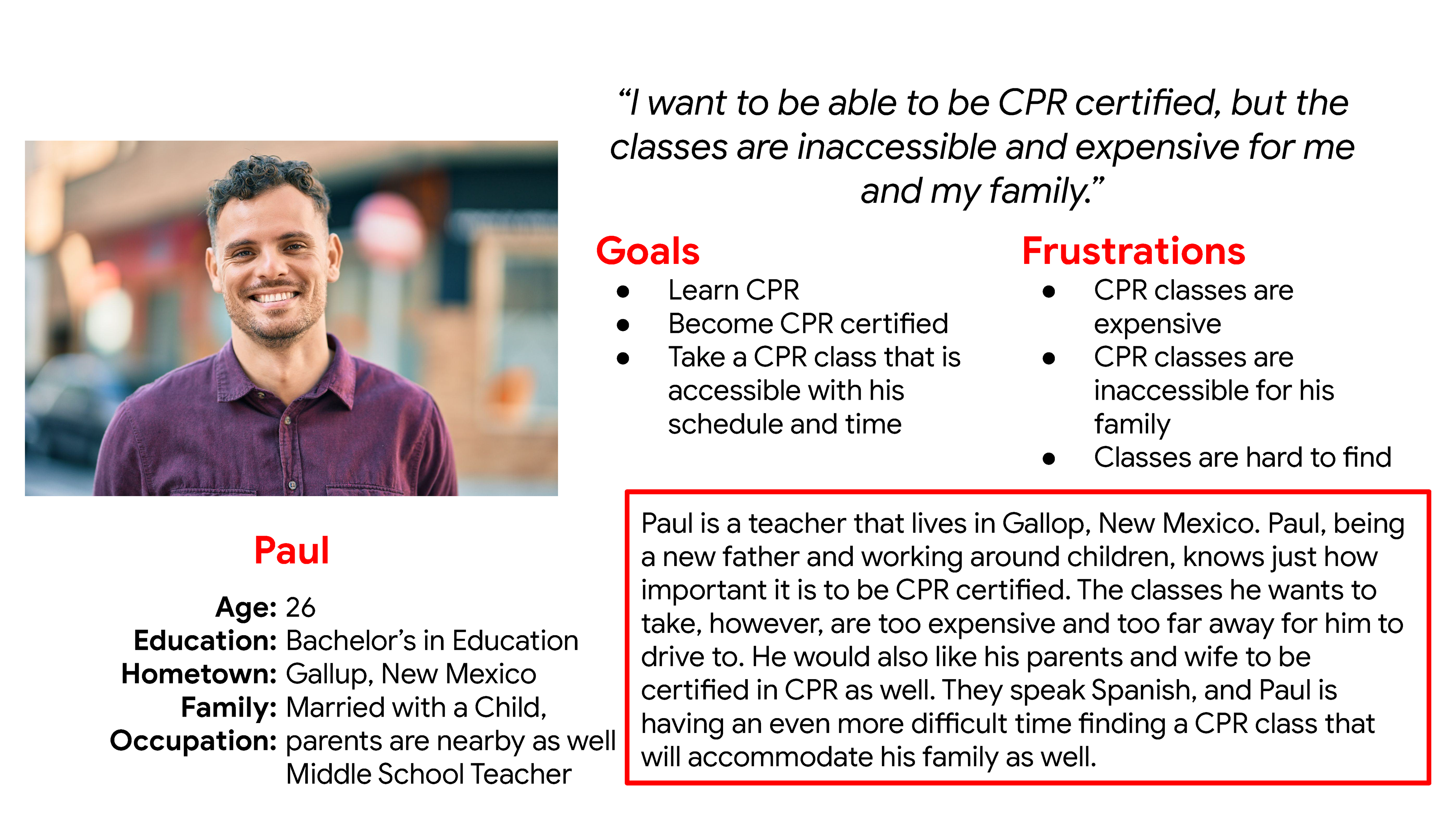
Paul is a teacher who knows the importance of learning CPR, and how life saving this procedure is. He wants his family to learn CPR as well, but is having a difficult time finding a class accessible for his Spanish-speaking relatives.
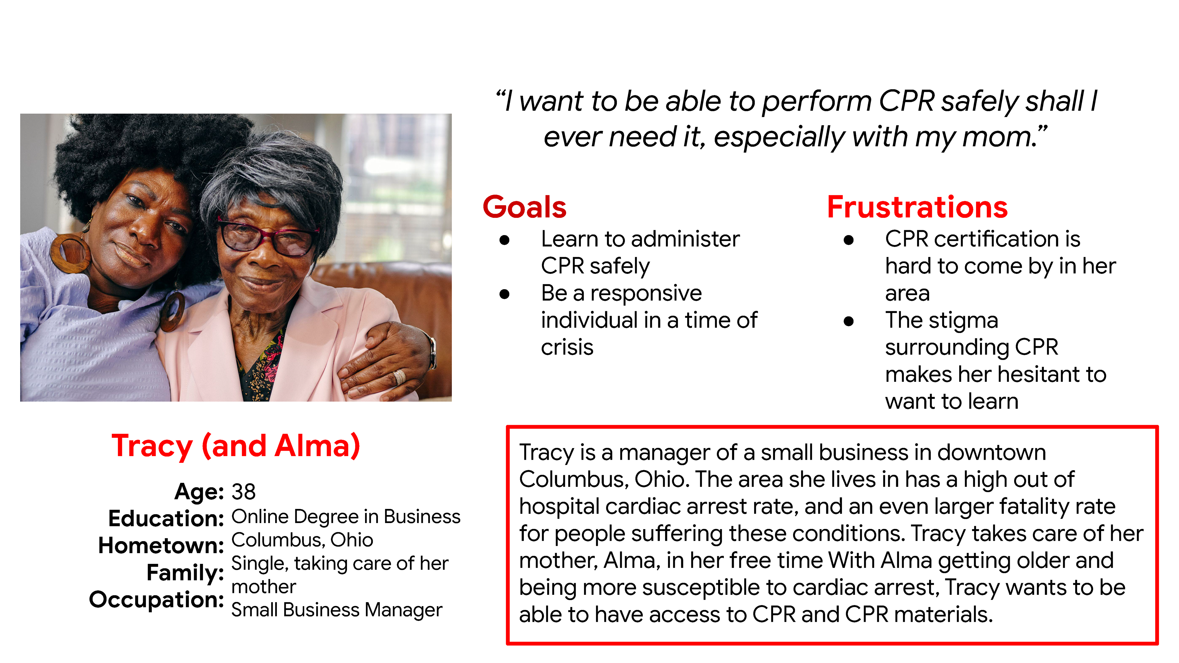
Tracy lives with her mother, Alma. Tracy lives in an area where a lot of out of hospital cardiac arrests happen. However, Tracy is afraid to be away from her mother, Alma, for too long She's also nervous to learn CPR due to the controversy she's heard surrounding it in media.
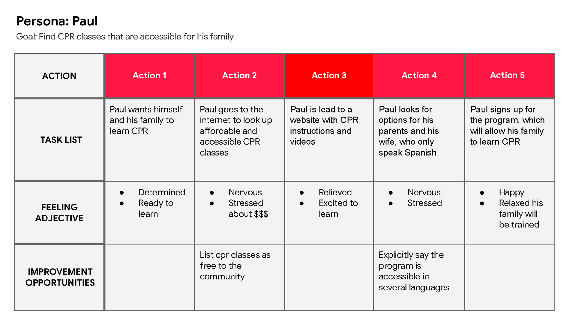
Paul wants to find a CPR class he can afford, but also allows his family to learn beside him as well.

Tracy wants to learn a CPR class from the comfort of her home, only having to go to classes for necessary steps as to not leave Alma home alone for extended periods of time.
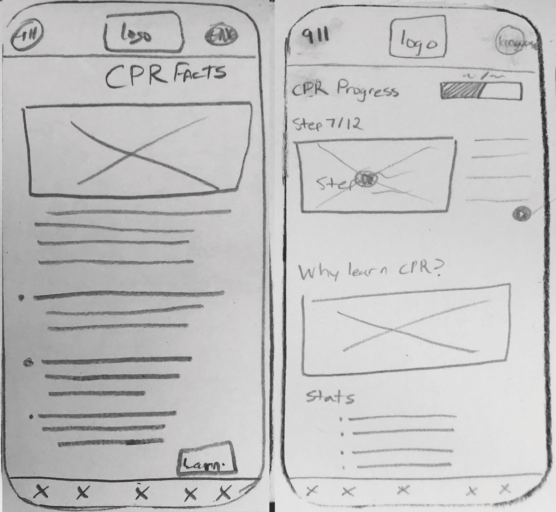
A facts page and a home page
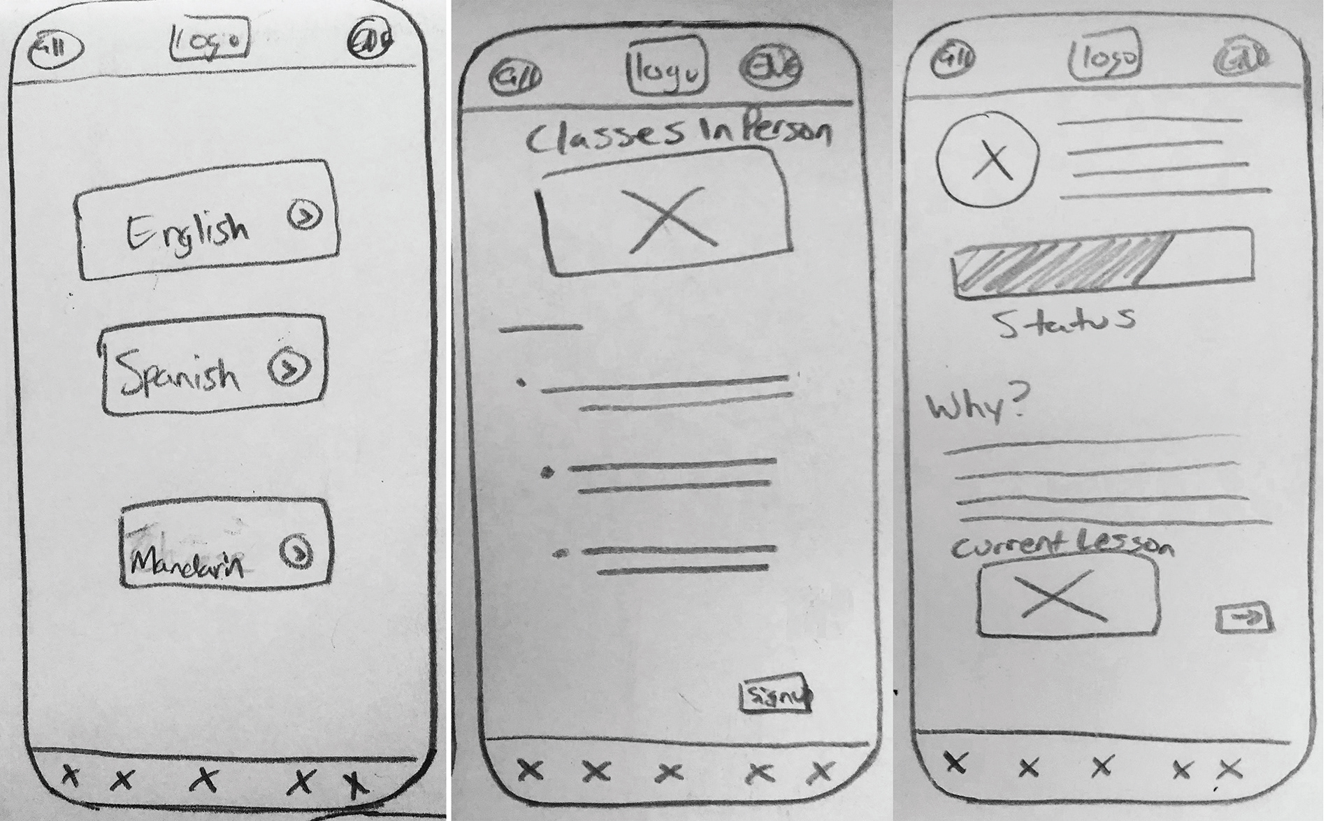
Language page, class page and a profile page
A class sign up page, a steps page and an example steps page

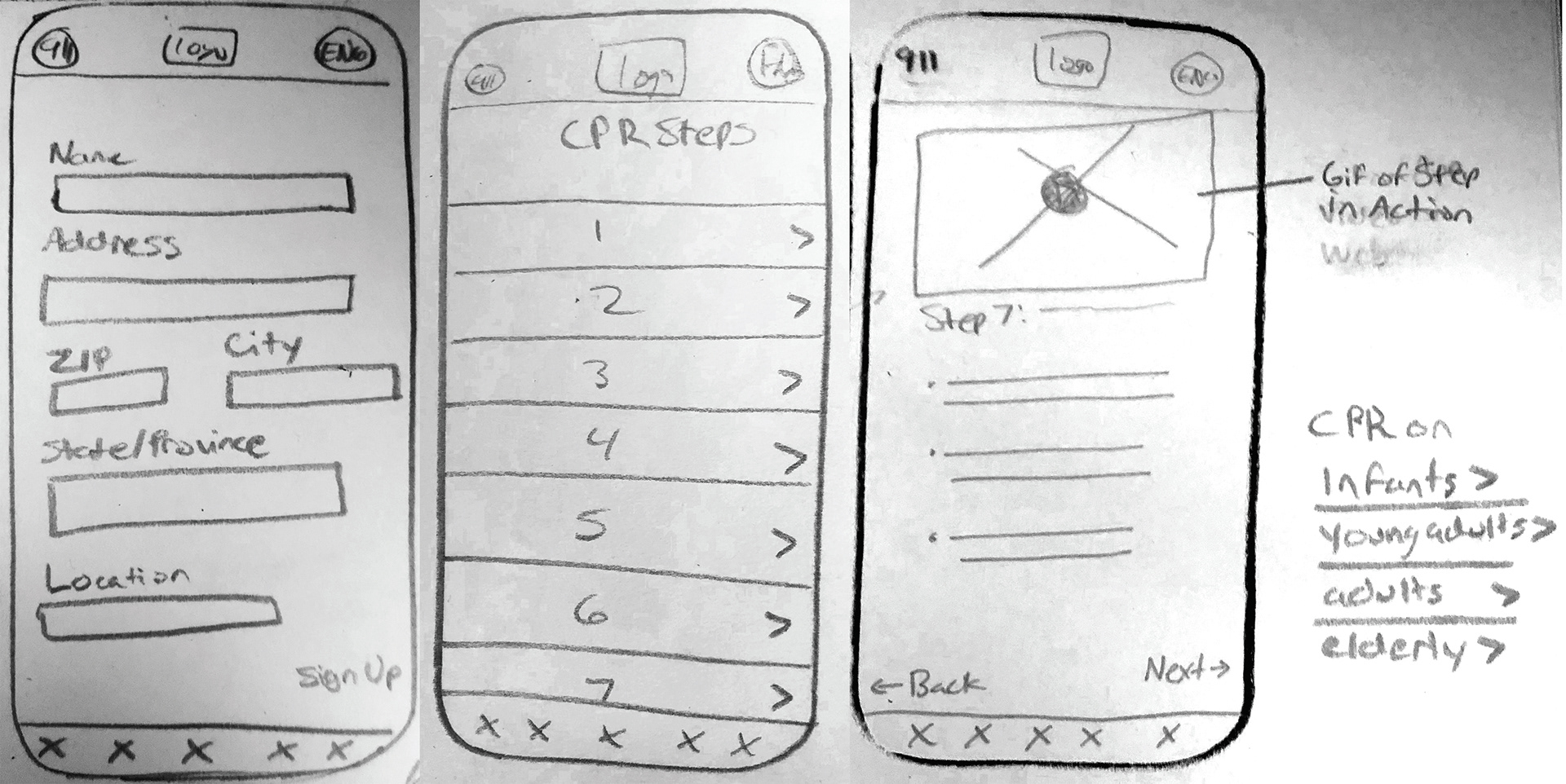
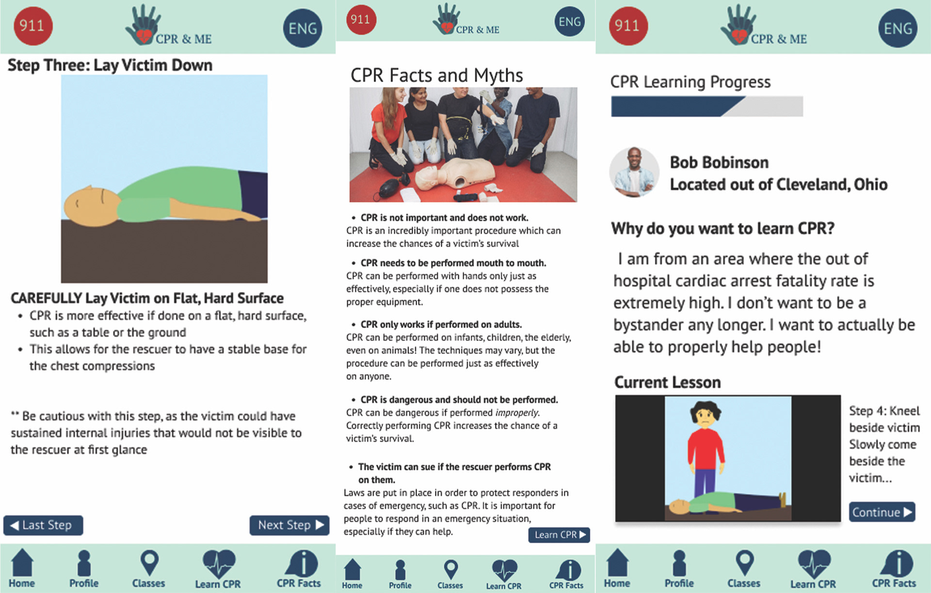
A CPR steps page, a facts/myths page and the home page

A language page (with the three most common languages spoken in the US listed), another CPR steps page that list them out individually, and a page listing the victim type page

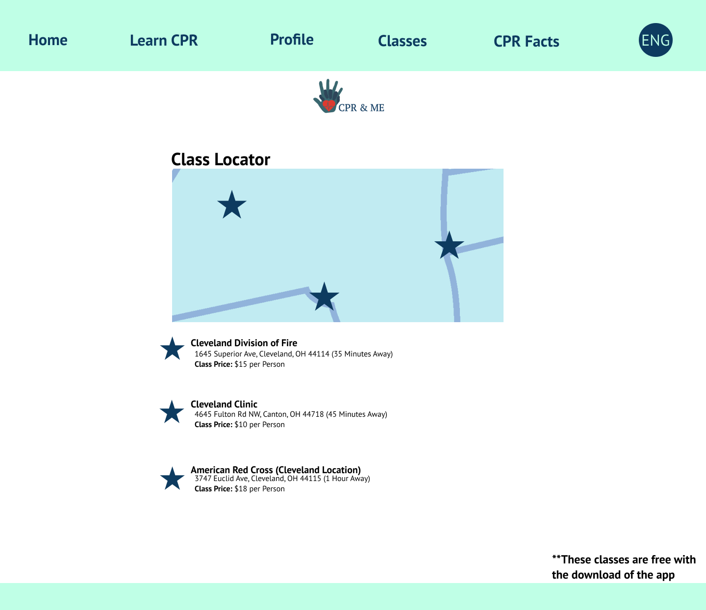
A class sign up page, a class location page, and a profile page
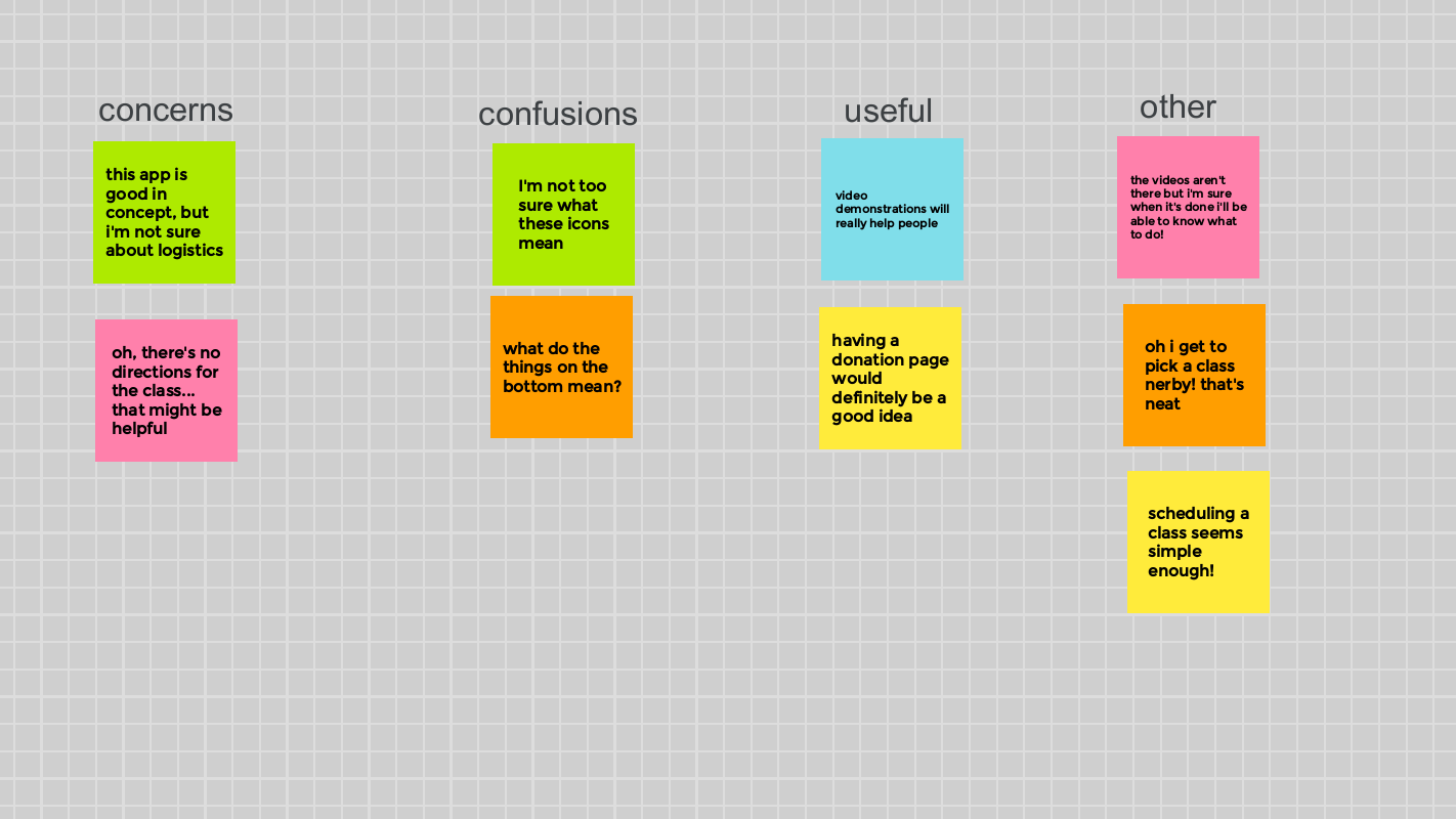
Affinity diagram from research testing
CPR step 3 for adults page, CPR myths and facts page and a profile page

Languages page, the selection page, and the steps page

Home page, a class sign up page and a class locator page

The 911 page, the class confirmation page and a donation page
A donation thank you page, which shows users how their contribution aids in helping more people learn CPR
Navigation through the app
Donation simulation
Learning CPR for Adult victims simulation
Learning CPR for young children and infants simulation
Class sign up simulation
How users would change languages to best suit their individual needs simulation

Website map for CPR & Me
Home Page
QR Page

Donation Page

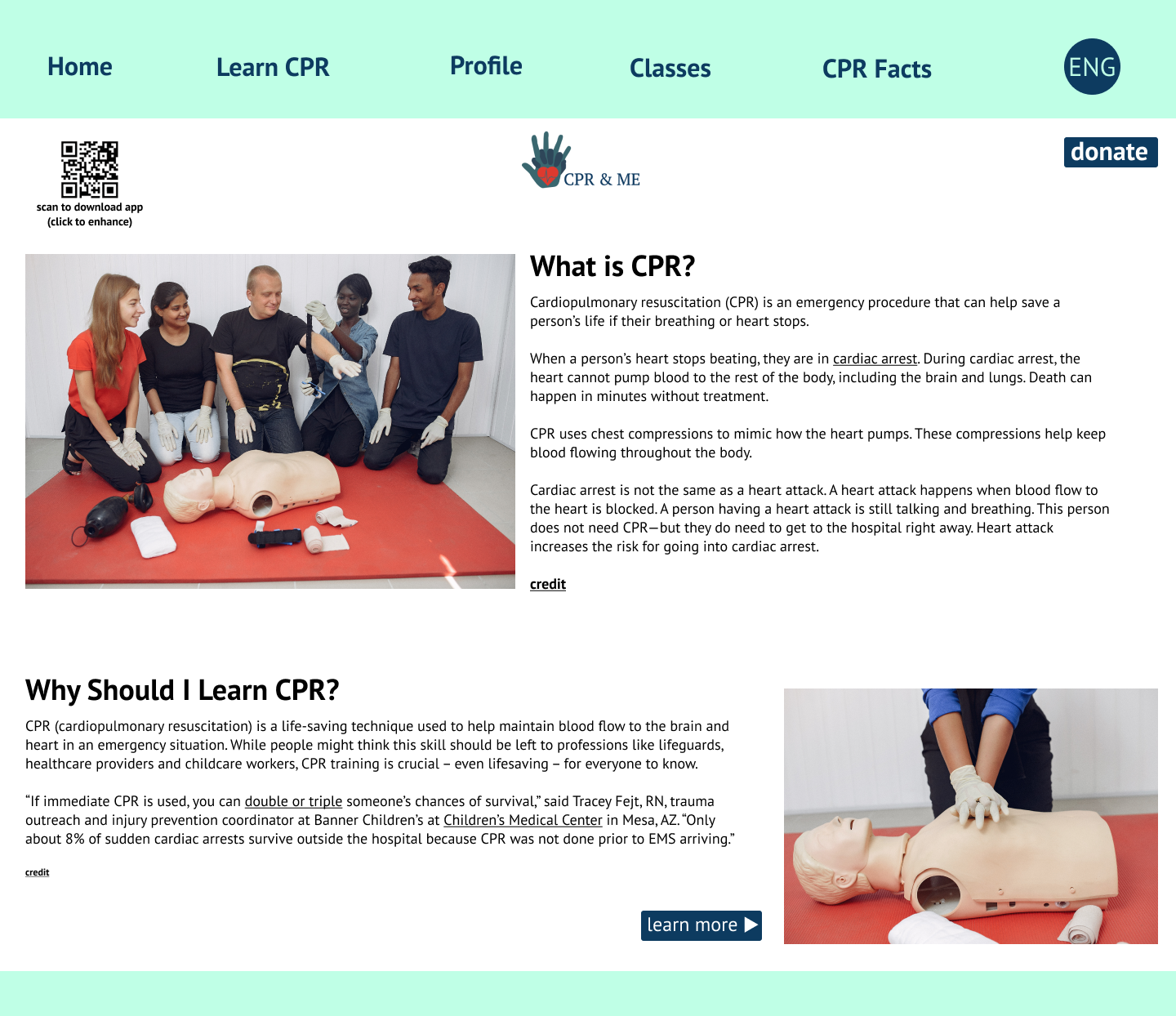
Learn CPR Page
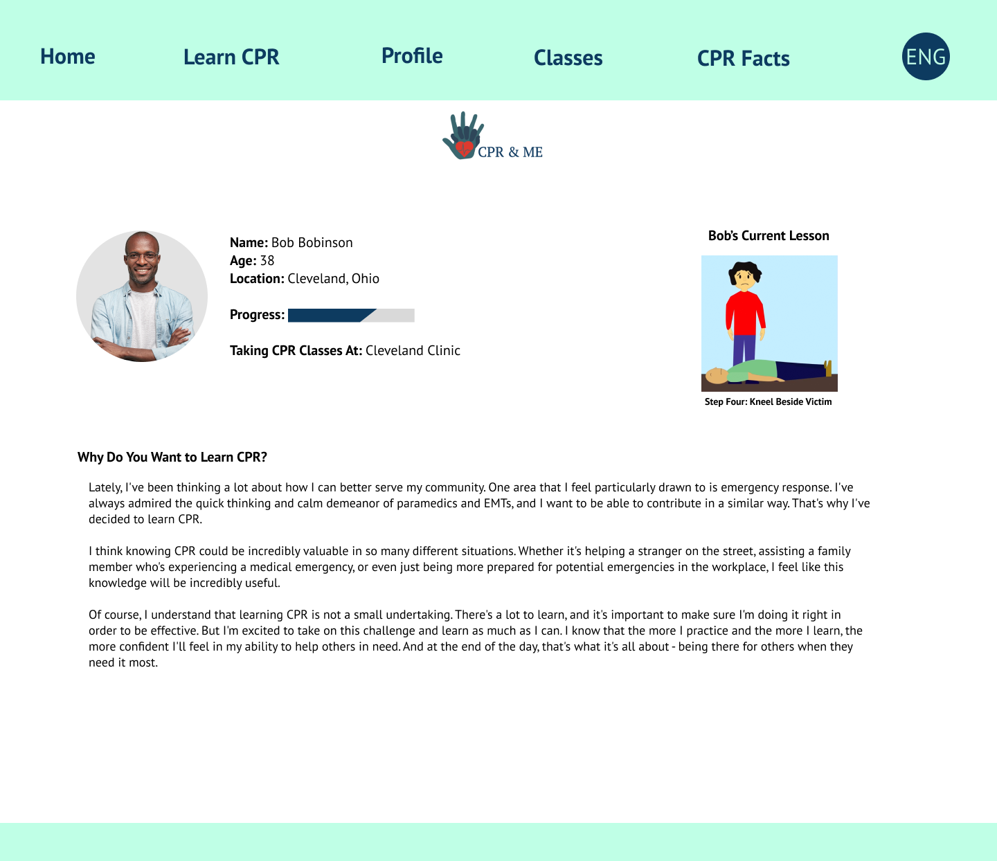
Profile Page
Classes Page
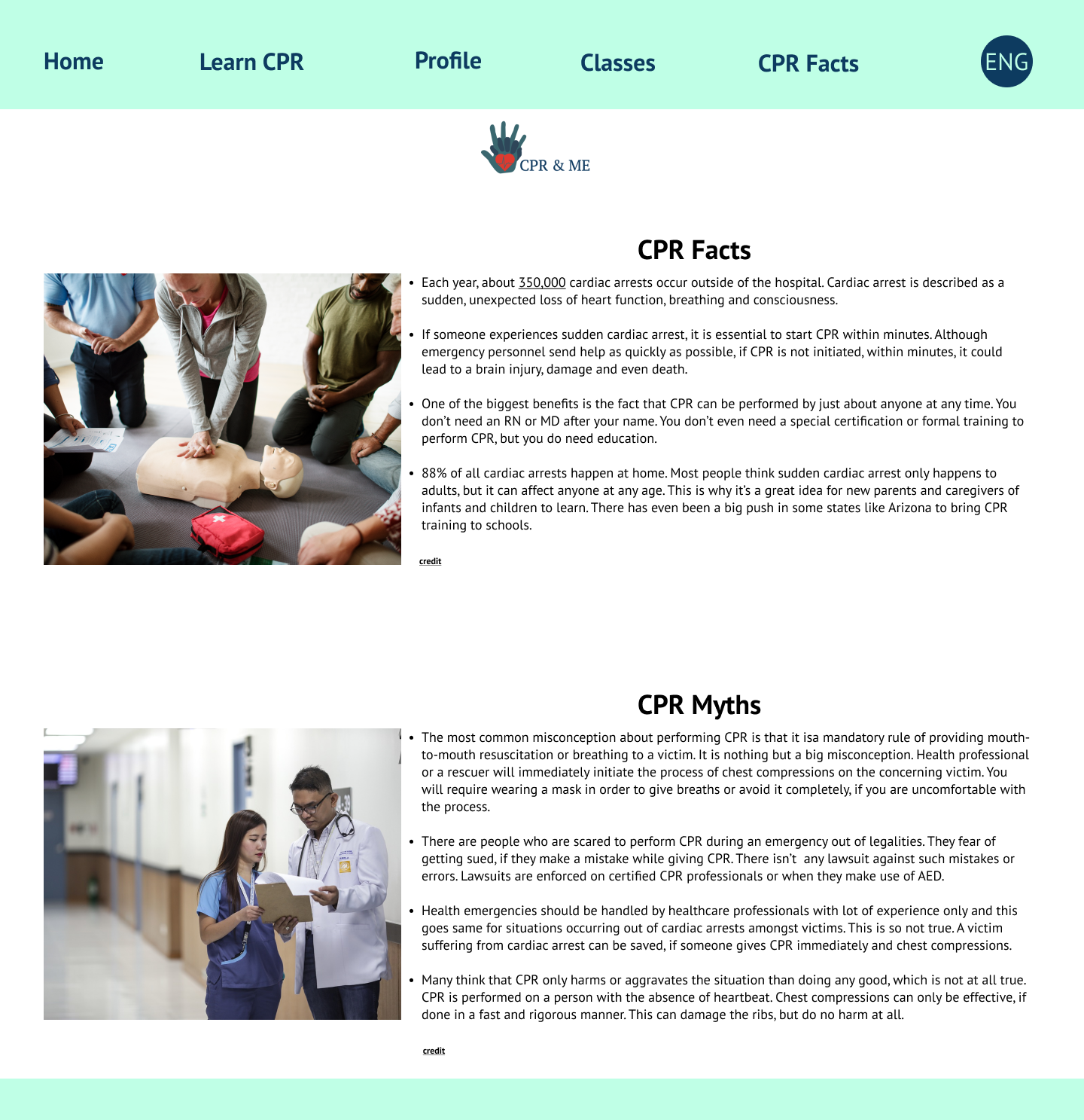
CPR Facts and Myths Page
Simulation of navigating the CPR & Me website
Step one for CPR for Adults: Check on the victim
Step two for CPR for both Adults and infants: Call 9-1-1
Step three for CPR for Adults: lay victim down on a hard, flat surface, tilting their chin upwards
Step four for CPR for Adults: kneel beside victim, placing your knees at their shoulder and at their torso
Step five for CPR for Adults: place your hands in the middle of their chest, with your fingers linked as shown above
Step six for CPR for Adults: give chest compressions, firm and quickly, ensuring their chest moves with each compression
Step one for CPR for Infants and Young Children: Check on the victim (if the victim is a baby, check for breathing or other movement)
Step three for CPR for Infants and Young Children: lay victim down on a hard, flat surface
Step four for CPR for Infants and Young Children: kneel beside victim, placing your knees firmly beside their body
Step five for CPR for Infants or Young Children: place your fingers in the middle of their chest, with your fingers linked as shown above
Step six for CPR for Infants and Young Children: give chest compressions, firm and quickly, ensuring their chest moves with each compression (obviously being more careful than you would with an adult)